Marquette, MI
Nordic Theater
Responsibilities: UI/UX Design, Product Design, Branding & Style Guides, Wireframes, Prototypes, Coding
Scroll ↓
Designing for a “moderne” masterpiece
Project Overview: The Nordic Theater, a cinema in Marquette, MI, recently underwent a revival process in the hope of bringing movies back to the downtown district. This 1936 single screen theater is unlike any other in the country, eschewing ornate decoration often seen in older theaters for Streamline Moderne (or space age) aesthetics.
Tasks: Develop initial wireframes, web presence and branding to promote the cinema. This includes creating a responsive site, a logo and branding that is minimal, sleek and utilizes Streamline Moderne design influences that translate to a digital experience. Design the UI/UX for ticket purchasing and checkout. Include the historical background and the architectural significance of the cinema. Educate visitors on films that screened at the cinema and incorporate a gallery of historical photos.
Our Problem: Buying Movie Tickets Online
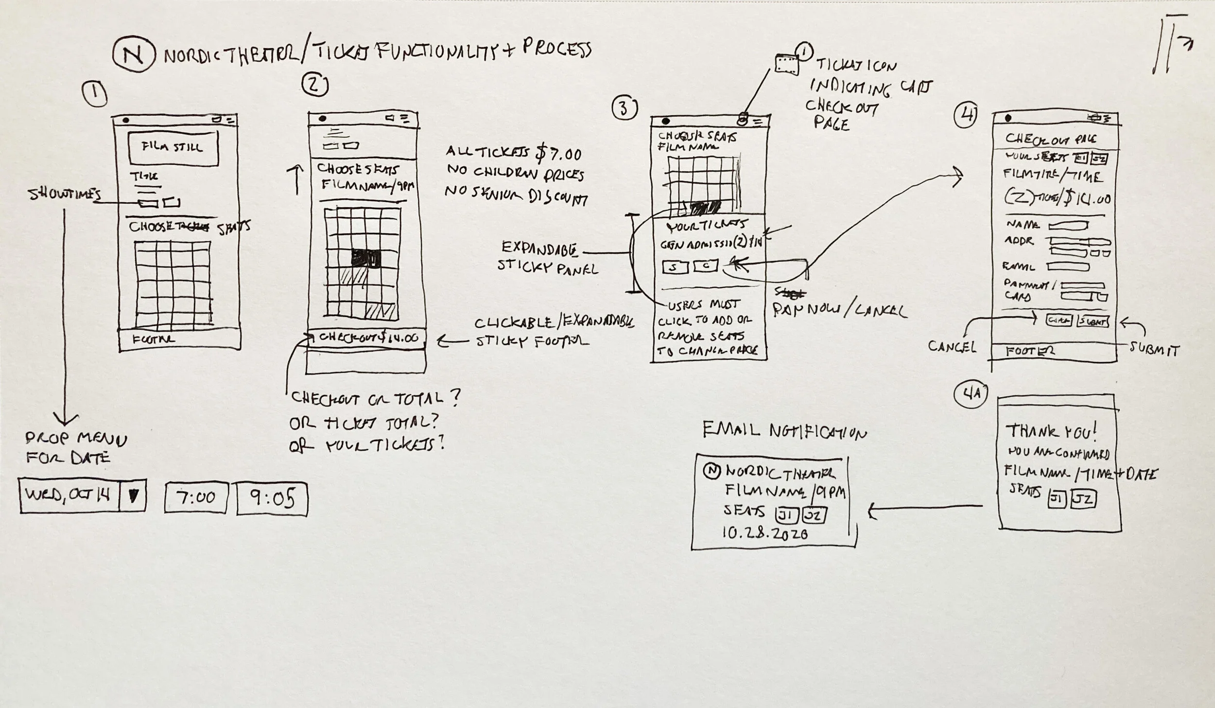
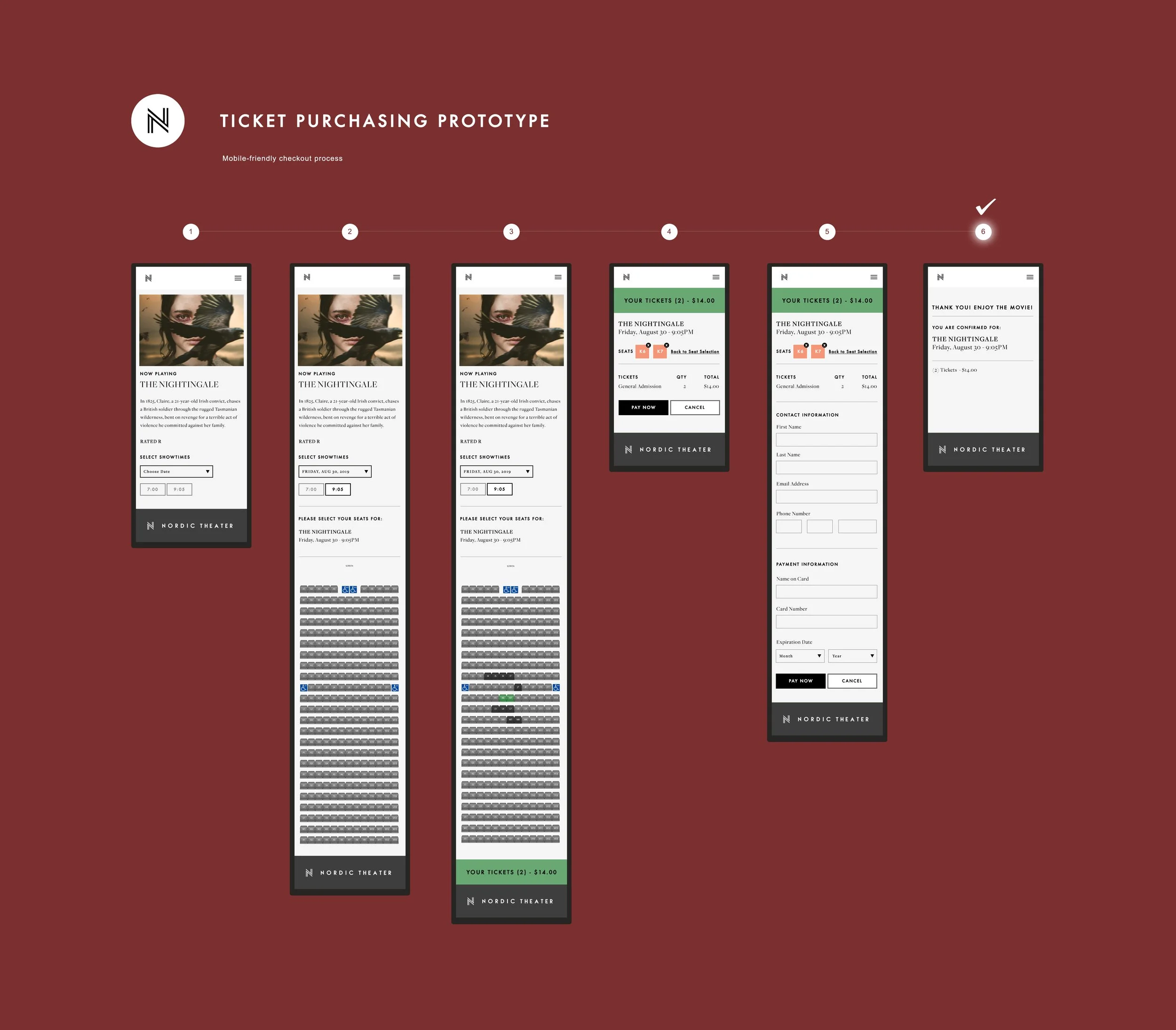
Third-party applications for buying movie tickets online were not to our specifications in terms of user experience. Most required a five-step process in which the user had to activate a drop menu for movie tickets on the homepage, then go to the movie page to select the showtime, select quantity of tickets, select seats, and check out. I set out to design an application that streamlined the process and would allow the users to buy the tickets in just three steps: 1) Select Showtime, 2) Select Seats, 3) and Checkout via a sticky footer all on one page, in addition to being more on brand with the rest of the site.
Initial User Flow Sketch
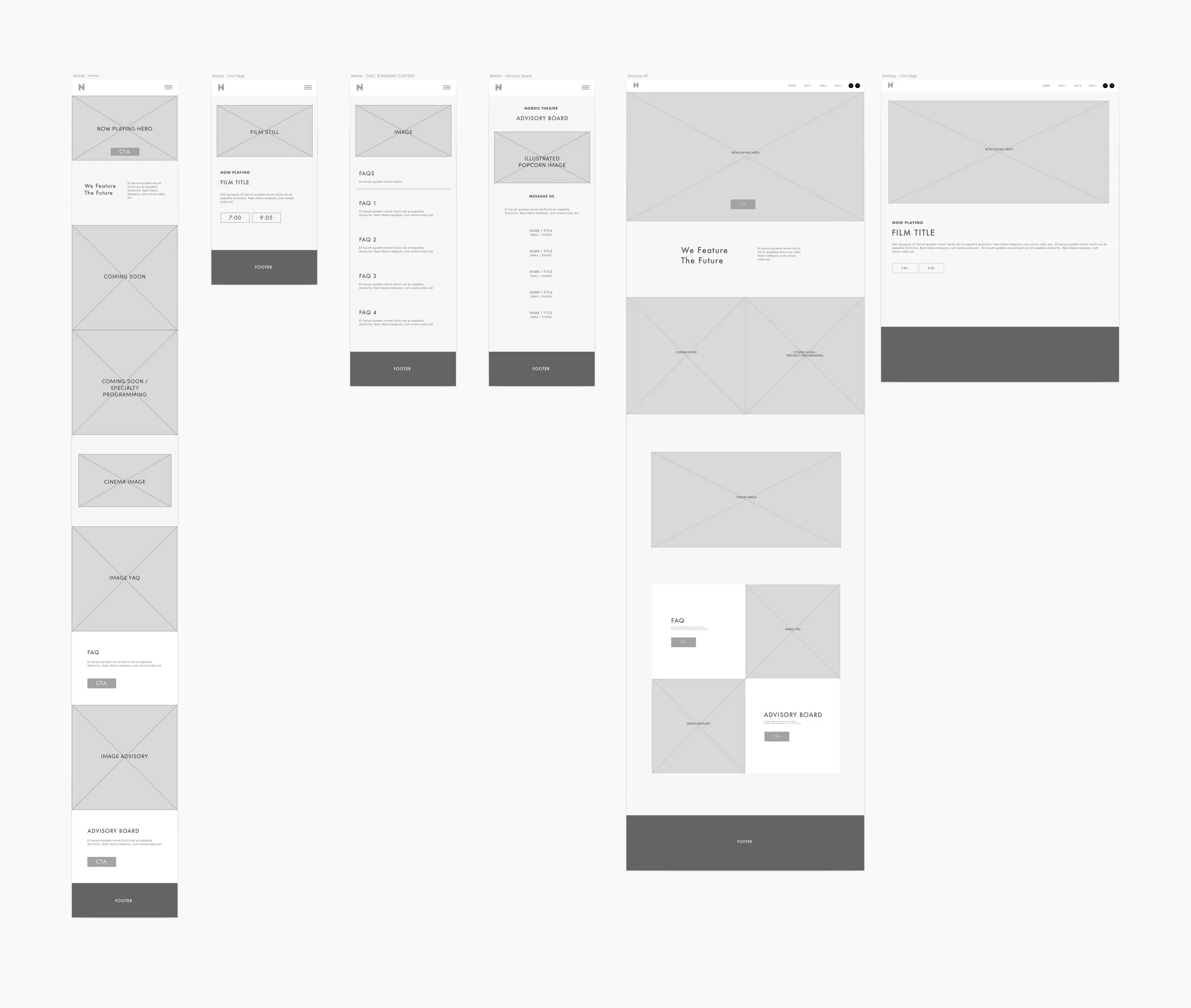
Wireframes of Ticket Purchasing Process
Prototypes of Ticket Purchasing Process
Visual Design & Branding
When building the website design for the Nordic Theater, I began with wireframes to draft a component structure that would account for any type of content. From there, branding came easy as I adopted a fairly minimal aesthetic to reflect the atmosphere of the cinema and implemented a black and white design with the shades of gray and red that were in the facilities interior.
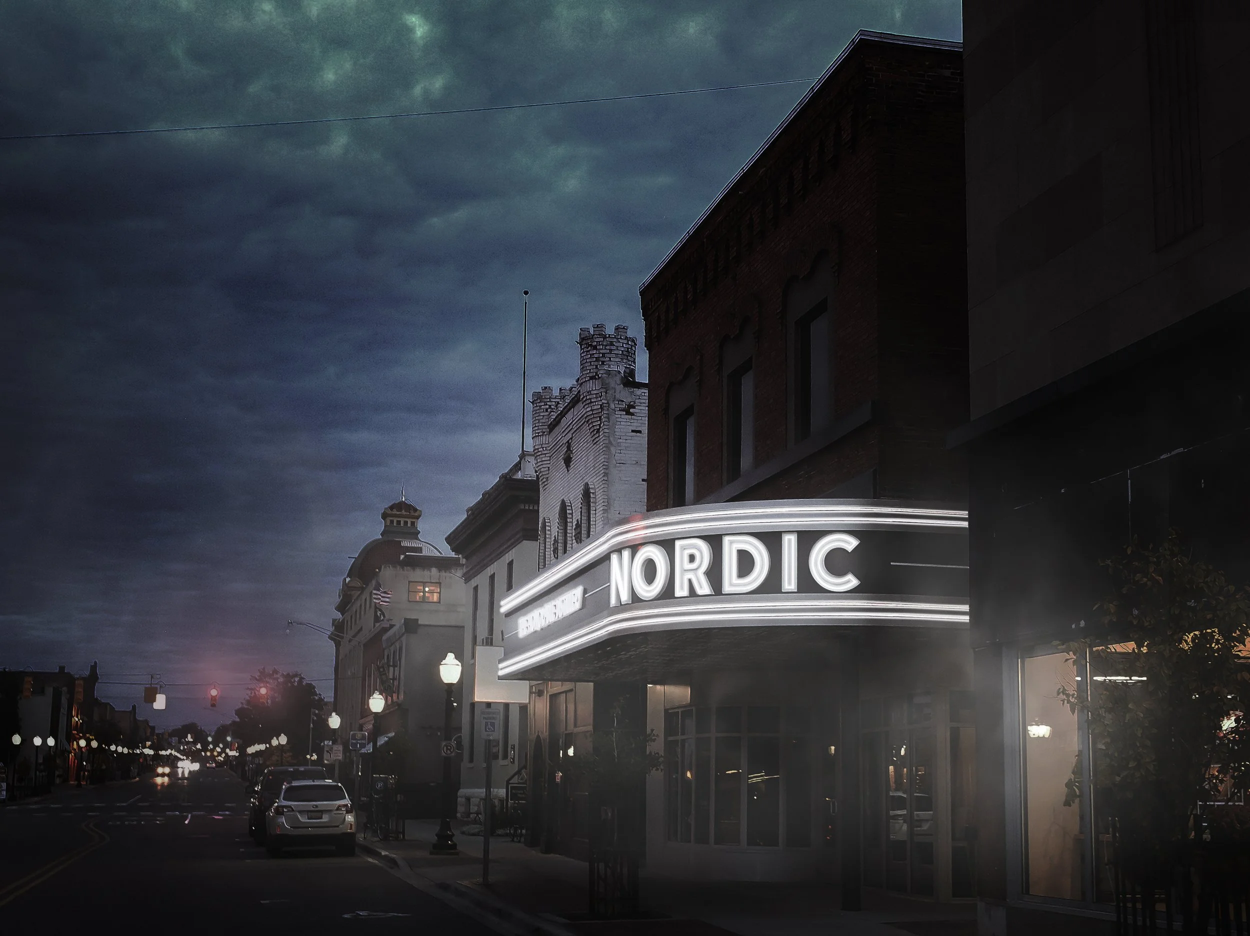
The logo is a take on the two bars of neon light that stretch across the cinema’s marquee. Font choices came down to a bold, san-serifed Futura and deco-style serifed font that had been used in the some of the promotional items for the cinema in the 1930’s.
Historical Site / Branding
A restored Nordic Theater in 2022.


